The GTA Place - Grand Theft Auto news, forums, information, screenshots, guides, cheats...
New Exclusive GTA IV Screenshot
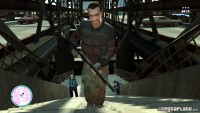
Rockstar have just sent us this exclusive screenshot for The GTA Place, it's among the first digital shots to show the HUD.
See more exclusives at GTA4.net, PlanetGTA, GTA4.tv, GTAGaming, GTASite.net, GTANetwork.it, GTA-Series.com, GTAGames.nl, GTAInside.com, GTAWH, GrandTheftAuto4.fr and GrandTheftWiki
Thanks again Rockstar!



Yeah, I'm just trying to work out why it's coloured like that. Look at GTAGaming, their shot shows the HUD in the normal colour :/
Ye isn't the Armor and the Health meant to go round the map, I read it somewhere, can't remeber where.
Did you notice that he's gun is going through his arm... I really don't hope it will be just like it was in the other GTA games with that kind of stuff. And the map is different on every screenshot but I don't know why, maybe you can change the color.
I don't think R* takes screenshots of the final stages of the game, I think thats from a older version.


Wow. The HUD looks empty, but it's cool.


Reason for the difference in map colors is probably because you can change the colors. This may also apply to cars, the speedometers. Like you could do in Need For Speed: Most Wanted.....
If not that then it could be an automatic thing. Where if the background is similar to the colors used in the HUD, it will change. So you can see the map more clearer, instead of turning around just to see if what you are looking at is correct. That would make sense but still not sure if that is plausible......Or when you enter new cities. Anyway there are a few ideas.
Anyway, these screenshots look cool. Very simple but effective. Now i can enjoy the city, instead of seeing how lovely my gun icon is in the top right!

Wow, looks excellent, also it appears that not only are stores located on the map but those police are as well.
Also notice the artsy effect this game suffers in screenshots...it's interesting, it looks like some parts of the picture have really low detail or are painted on...but this effect doesn't appear in video (trailers) of the game...why just still pictures?

LOL, where's the clock?
I'm pretty sure that the picture TM posted is from a magazine...look at the little text box by the HUD.
Notice the oddly colored characters.


It sucks, too small and where is the health bar, BTW the graphics in this obvious gameplay pic look like shit, Nintendo 64 could do better.
If you'd read the previous posts in the topic...specifically mine, you would have read that for some reason GTA IV's screenshots have weird effects but they don't persist in video of the game so the graphics obviously won't look bad like that in the actual game...would OXM have praised the graphics if they had?
And you should also read up on the news, health is that green bar displayed around the radar.
And the HUD is fine, you can see more on the screen it it's really helpful considering GTA is in high-definition on consoles this time around, so it won't take up half the screen if you have a standard TV.
Also you can probably check the time on your phone.

rubbish looking textures in that picture.. very.. san andreas like. and the HUD is rubbish. wheres the clock? wheres the cartoon style guns ? i know they are going for minimalistic if thats how you spell it. but still, for a game thats meant to blow people away.. the HUD sure as hell undermines the whole thing. but yeah, no one thats plays it has complained.. it got 10/10 .. so im sure it will be good.. BESIDES who here aaaaaaaactually looks at it? when your changing guns yes, or when your looking at the map .. but when the health and armour are next to the map and the fact you can tell which gun nikos holding by looking at it.. then really thats all you ever need.. and the map in old gta was more than enough. so i'm not 100% bothered realy.
hey off topic thing , but who here has a pre-order date thats before the release date? i have a pre-order for amazon, i'm apart of the very first batch as i pre-ordered like 10 months ago almost.. and my DELIVERY estimate is on the 24th! .. shipped on the 23rd. and other people seem to have around the 25th that are on the same batch.. or the 2nd batch.. where as others on the most recent batches are more like the 1st or 2nd. if you've pre-ordered whats yours?

I'm going to say that I like the HUD. Rubbish? It's got everything the old GTA's had. Health, Armor, Stars, Weapon Icons and ammo. The only thing it lacks is the time, which I'm sure will be checked on your phone. Everything is small and sleek now, so I'm only praising this.
But on the topic of textures, I'm sure the gameplay will look much better than this. As it has been said, the trailers are an example of that.
Also, on the map color - I'm partly with The Dealer. I could see how the map could change colors through portions of the map, or by personal preference, but the different colors we're seeing might be the wanted stars level. I noticed in other exclusives, the portion of map that was marked by the search areas (Where you try to escape from) was differently colored. Perhaps what we're seeing is the search area extending beyond the displayed portion of the map?

This is seriously disappointing. Makes me feel like taking off my pre-order. It looks like shit in this screen. The gun going through his arms, the cop in the back look like twin lego men and things look so blocky. In some of the other screen shots it looks very block, very technicolor and very shitty. I'm scared man. I dont know what to do. You guys just think that these very few bad screens are early screen? Think we should be worried? I'm very concerned, considering I spent .46 on this game. (Special Edition)


Holy shit! Read the post! The blockiness/low-detail is an issue with screenshots. Even in the 1st trailer from GTA IV you didn't see that. It's only in the screenshots. The game will not look like that!
Dude, chill the fuck out asshole! I read it, but I don't think thats viable. How can taking a screen pic effect the graphics? I don't get that.
I thought the pic was a San Andreas mod or something at first, not that that's bad but the pic just looks washed out and downgraded to me. The videos however really don't show these adherent flaws so I am assuming its a problem of capturing a still picture from the game and the way its seen on the internet (okay, I may be making excuses now, haha!). But in all seriousness, I really don't think this is what the actual game will look like..... I hope. I really like the multi levelness of the pic though, very cool!!!! ![]()

This is seriously disappointing. Makes me feel like taking off my pre-order. It looks like shit in this screen. The gun going through his arms, the cop in the back look like twin lego men and things look so blocky. In some of the other screen shots it looks very block, very technicolor and very shitty. I'm scared man. I dont know what to do. You guys just think that these very few bad screens are early screen? Think we should be worried? I'm very concerned, considering I spent .46 on this game. (Special Edition)
Go ahead, take back your pre-order... Just know that that you'll be missing out on the biggest game of this decade...
So the graphics might not be the best... It's whats under the hud (no pun intended) that matters...

This is seriously disappointing. Makes me feel like taking off my pre-order. It looks like shit in this screen. The gun going through his arms, the cop in the back look like twin lego men and things look so blocky. In some of the other screen shots it looks very block, very technicolor and very shitty. I'm scared man. I dont know what to do. You guys just think that these very few bad screens are early screen? Think we should be worried? I'm very concerned, considering I spent .46 on this game. (Special Edition)Go ahead, take back your pre-order... Just know that that you'll be missing out on the biggest game of this decade...
So the graphics might not be the best... It's whats under the hud (no pun intended) that matters...
Ok, I changed my mind, but any ways yeah I guess. I wasn't complaining so much about the graphics, but it's just the gun is through his are. That seems really last gen to me you know. It'll still be one of the greatest games of all time, I was just nervous, thats all.

It dont look tht bad tbh, just hope the game dont look like it though...


Comments